Case-Shiller Background
The Case-Shiller numbers for January 2011 were released today, and the data shows that the nationwide decline in home prices is continuing. Of the 20 metro areas tracked by Case-Shiller, 19 showed a decline in January. I thought it would be interesting to take a closer look at how the Case-Shiller index in each market has performed over time.
Explanation of Plots
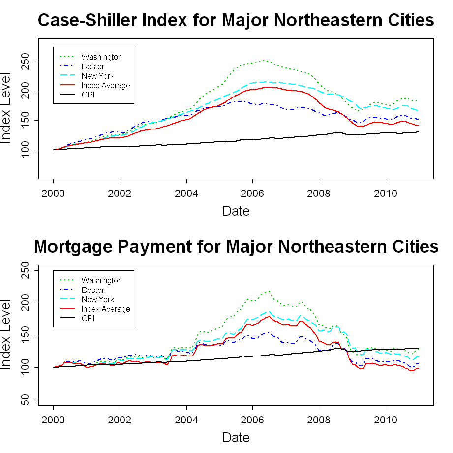
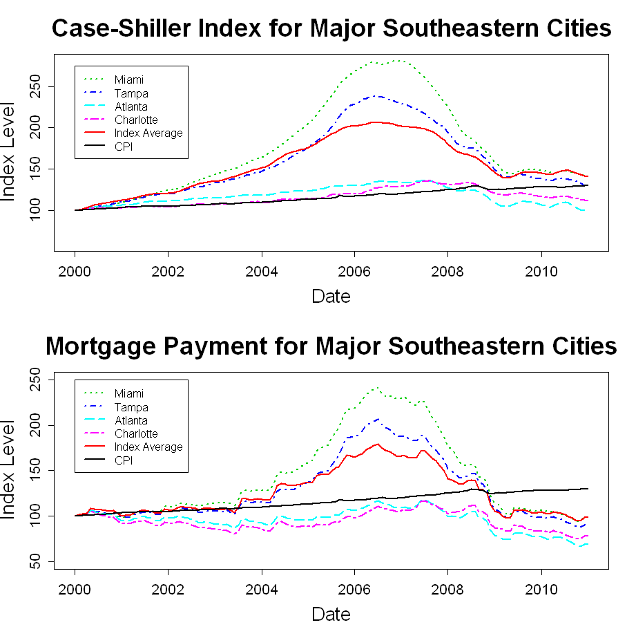
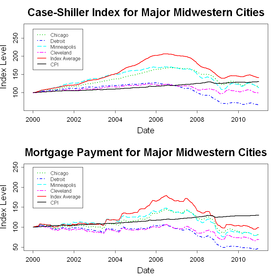
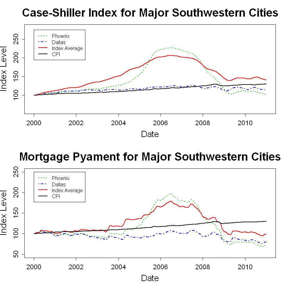
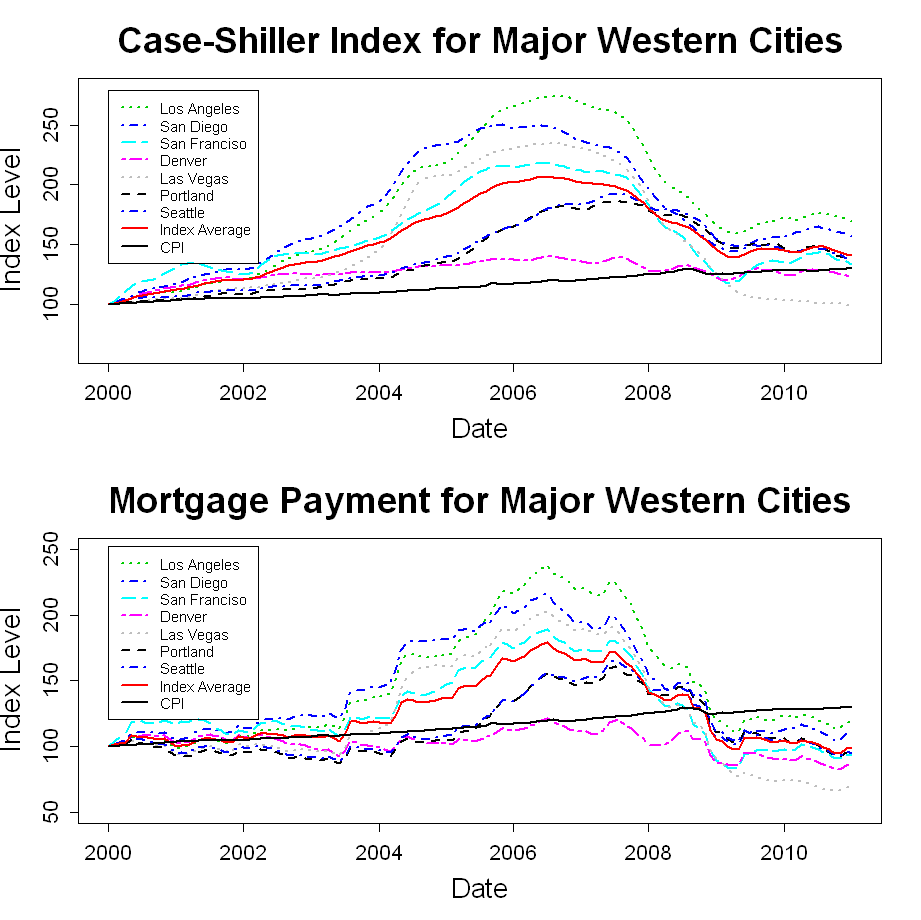
In this post, I have plotted the Case-Shiller metro area data from January 2000 through January 2011. I have assigned each metro area to one of five U.S. regions, and I have created a plot for each region.
The top window of each plot shows how “constant-quality” home prices have varied for each metro area within the region. In addition, the Consumer Price Index (CPI) and the 20-city Case-Shiller composite index are shown in each plot.
In the bottom window, I have adjusted each housing index on each date by the interest rate for a 30-year fixed mortgage on that date using the annuity payment equation.
![]()
In other words, this window shows an index of how mortgage payments have varied over time for a new buyer of a “constant-quality” home. The payment indexes have also been rescaled to a starting value of 100.
The purpose of the mortgage-rate-adjusted plots is to give some idea of how home affordability has varied over time. I am not suggesting that payment level is the only thing that matters to the new home buyer, and I am not suggesting that home valuation should vary directly with mortgage rates. However, mortgage rates do play a role in the home purchase decision, and I think it is interesting to look at this transformation of the Case-Shiller data.
Regional Case-Shiller Plots
The plots below show the Case Shiller data for each U.S. region.
Takeaways
The Case-Shiller data shows that, in many markets, housing is as cheaper, in inflation adjusted terms, than it has been at any time in the past decade. In fact, after adjusting for both current mortgage rates and inflation, housing is more affordable in all twenty markets than in was in January of 2000.
Additional Info
Data: The Case-Shiller data was downloaded from the S&P website, and the CPI and mortgage rate data was downloaded from the FRED website.
Code: The R-code for generating the plots is shown below.
# Load data from CSV files
cs <- read.table("caseshiller2.csv",header=TRUE,sep=",")
rates <- read.table("mortgagerates.csv",header=TRUE,sep=",")
cpi <- read.table("cpi_data.csv",header=TRUE,sep=",")

# Convert Mortgage rates to monthly rates
mrates <- rates[,2]/1200

# Rescale CPI to a base of 100 in January 2000
cpi <- cpi[1:length(mrates),2]/cpi[1,2]*100

# Calculate mortgage payment and rescale to base value of 100
a <- mrates + mrates/((1+mrates)^360-1)
pmt <- a*cs[2:23]/a[1]

# Create date range for x-axis
dates <- 2000 + (0:132)/12

# Plots for Western Cities
dev.new(width=11,height=11)
par(mfrow=c(2,1))
west <- cbind(cs[3],cs[4],cs[5],cs[6],cs[16],cs[19],cs[21],cs[23],cpi)
matplot(dates,west,type='l',xlab="",ylab="",lty =c(3,4,5,6,3,2,4,1,1),col=c(3,4,5,6,8,9,4,2,1),lwd=c(2,2,2,2,2,2,2,2,2),ylim=c(60,280),cex.axis=1.3)
legend(2000,279,c("Los Angeles","San Diego","San Franciso","Denver","Las Vegas","Portland","Seattle","Index Average","CPI"),lty = c(3,4,5,6,3,2,4,1,1),col=c(3,4,5,6,8,9,4,2,1),lwd=c(2,2,2,2,2,2,2,2,2),cex=0.9)
title("Case-Shiller Index for Major Western Cities",xlab="Date",ylab="Index Level",cex.main="2.25",cex.lab="1.75")

mwest <- cbind(pmt[2],pmt[3],pmt[4],pmt[5],pmt[15],pmt[18],pmt[20],pmt[22],cpi)
matplot(dates,mwest,type='l',xlab="",ylab="",lty = c(3,4,5,6,3,2,4,1,1),col=c(3,4,5,6,8,9,4,2,1),lwd=c(2,2,2,2,2,2,2,2,2),ylim=c(50,250),cex.axis=1.3)
legend(2000,252,c("Los Angeles","San Diego","San Franciso","Denver","Las Vegas","Portland","Seattle","Index Average","CPI"),lty = c(3,4,5,6,3,2,4,1,1),col=c(3,4,5,6,8,9,4,2,1),lwd=c(2,2,2,2,2,2,2,2,2),cex=0.9)
title("Mortgage Payment for Major Western Cities",xlab="Date",ylab="Index Level",cex.main="2.25",cex.lab="1.75")

# Plots for Southwestern Cities
dev.new(width=11,height=11)
par(mfrow=c(2,1))
southwest <- cbind(cs[2],cs[20],cs[23],cpi)
matplot(dates,southwest,type='l',xlab="",ylab="",lty = c(3,4,1,1),col=c(3,4,2,1),lwd=c(2,2,2,2),ylim=c(60,280),cex.axis=1.3)
legend(2000,275,c("Phoenix","Dallas","Index Average","CPI"),lty = c(3,4,1,1),col=c(3,4,2,1),lwd=c(2,2,2,2))
title("Case-Shiller Index for Major Southwestern Cities",xlab="Date",ylab="Index Level",cex.main="2.25",cex.lab="1.75")

msouthwest <- cbind(pmt[1],pmt[19],pmt[22],cpi)
matplot(dates,msouthwest,type='l',xlab="",ylab="",lty = c(3,4,1,1),col=c(3,4,2,1),lwd=c(2,2,2,2),ylim=c(50,250),cex.axis=1.3)
legend(2000,250,c("Phoenix","Dallas","Index Average","CPI"),lty = c(3,4,1,1),col=c(3,4,2,1),lwd=c(2,2,2,2))
title("Mortgage Pyament for Major Southwestern Cities",xlab="Date",ylab="Index Level",cex.main="2.25",cex.lab="1.75")

# Plots for Midwestern Cities
dev.new(width=11,height=11)
par(mfrow=c(2,1))
midwest <- cbind(cs[11],cs[13],cs[14],cs[18],cs[23],cpi)
matplot(dates,midwest,type='l',xlab="",ylab="",lty = c(3,4,5,6,1,1),col=c(3,4,5,6,2,1),lwd=c(2,2,2,2,2,2),ylim=c(60,280),cex.axis=1.3)
legend(2000,275,c("Chicago","Detroit","Minneapolis","Cleveland","Index Average","CPI"),lty = c(3,4,5,6,1,1),col=c(3,4,5,6,2,1),lwd=c(2,2,2,2,2,2))
title("Case-Shiller Index for Major Midwestern Cities",xlab="Date",ylab="Index Level",cex.main="2.25",cex.lab="1.75")

mmidwest <- cbind(pmt[10],pmt[12],pmt[13],pmt[17],pmt[22],cpi)
matplot(dates,mmidwest,type='l',xlab="",ylab="",lty = c(3,4,5,6,1,1),col=c(3,4,5,6,2,1),lwd=c(2,2,2,2,2,2),ylim=c(50,250),cex.axis=1.3)
legend(2000,250,c("Chicago","Detroit","Minneapolis","Cleveland","Index Average","CPI"),lty = c(3,4,5,6,1,1),col=c(3,4,5,6,2,1),lwd=c(2,2,2,2,2,2))
title("Mortgage Payment for Major Midwestern Cities",xlab="Date",ylab="Index Level",cex.main="2.25",cex.lab="1.75")

# Plots for Southeastern Cities
dev.new(width=11,height=11)
par(mfrow=c(2,1))
southeast <- cbind(cs[8],cs[9],cs[10],cs[15],cs[23],cpi)
matplot(dates,southeast,type='l',xlab="",ylab="",lty = c(3,4,5,6,1,1),col=c(3,4,5,6,2,1),lwd=c(2,2,2,2,2,2),ylim=c(60,280),cex.axis=1.3)
legend(2000,275,c("Miami","Tampa","Atlanta","Charlotte","Index Average","CPI"),lty = c(3,4,5,6,1,1),col=c(3,4,5,6,2,1),lwd=c(2,2,2,2,2,2))
title("Case-Shiller Index for Major Southeastern Cities",xlab="Date",ylab="Index Level",cex.main="2.25",cex.lab="1.75")

msoutheast <- cbind(pmt[7],pmt[8],pmt[9],pmt[14],pmt[22],cpi)
matplot(dates,msoutheast,type='l',xlab="",ylab="",lty = c(3,4,5,6,1,1),col=c(3,4,5,6,2,1),lwd=c(2,2,2,2,2,2),ylim=c(50,250),cex.axis=1.3)
legend(2000,250,c("Miami","Tampa","Atlanta","Charlotte","Index Average","CPI"),lty = c(3,4,5,6,1,1),col=c(3,4,5,6,2,1),lwd=c(2,2,2,2,2,2))
title("Mortgage Payment for Major Southeastern Cities",xlab="Date",ylab="Index Level",cex.main="2.25",cex.lab="1.75")

# Plots for Northeastern Cities
dev.new(width=11,height=11)
par(mfrow=c(2,1))
northeast <- cbind(cs[7],cs[12],cs[17],cs[23],cpi)
matplot(dates,northeast,type='l',xlab="",ylab="",lty = c(3,4,5,1,1),col=c(3,4,5,2,1),lwd=c(2,2,2,2,2),ylim=c(60,280),cex.axis=1.3)
legend(2000,275,c("Washington","Boston","New York","Index Average","CPI"),lty = c(3,4,5,1,1),col=c(3,4,5,2,1),lwd=c(2,2,2,2,2))
title("Case-Shiller Index for Major Northeastern Cities",xlab="Date",ylab="Index Level",cex.main="2.25",cex.lab="1.75")

mnortheast <- cbind(pmt[6],pmt[11],pmt[16],pmt[22],cpi)
matplot(dates,mnortheast,type='l',xlab="",ylab="",lty = c(3,4,5,1,1),col=c(3,4,5,2,1),lwd=c(2,2,2,2,2),ylim=c(50,250),cex.axis=1.3)
legend(2000,250,c("Washington","Boston","New York","Index Average","CPI"),lty = c(3,4,5,1,1),col=c(3,4,5,2,1),lwd=c(2,2,2,2,2))
title("Mortgage Payment for Major Northeastern Cities",xlab="Date",ylab="Index Level",cex.main="2.25",cex.lab="1.75")

Interesting data. I always look at this type of data from the perspective of how the economy looked in 2001-2002. I think the housing crisis would never have happened if the Fed hadn’t pushed rates down to 1% in mid 2003 and kept them there for a year and then jacked them up sharply. Your data tells me that at least the housing sector wasn’t that bad off in 2001-2002 and that Greenspan and Bernanke’s fears of deflation were overdone.
Your code reminds me of early code I saw in my career. It might work but readable it is not and maintainable by someone other than the original programmer soon after writing it would be hard.