Displaying Country Weights for International ETFs in Google Earth
Google Earth is a great tool for looking at many different types of data. A quick Google search will show hundreds of on-line Google Earth projects which use the tool to display data on everything from the health of marine ecosystems to the status of U.S. airline flights.
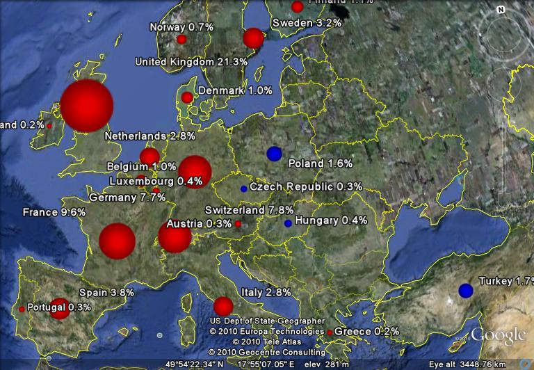
I've put together a Python script to display the country weights for two international ETFs; EFA is an iShares ETF which tracks the MSCI EAFE index, and VWO is a Vanguard ETF which tracks the MSCI Emerging Markets index. I used red placemarks for EFA and blue for VWO. In both cases, the area of the placemark is proportional to the country's weight in the respective fund. These weights vary over time with a country's market cap, so each country weight shown is for a particular date (9/30/2010 for EFA and 11/30/2010 for VWO).
A screenshot of the European section of the map is shown here:
Most of the countries in Western Europe are shown in red since they are part of the MSCI EAFE index of developed markets. The marker size and percent value indicate each country's weight within EFA. The blue markers in Eastern Europe show countries which are part of the MSCI Emerging Markets index, and the maker size and percent value indicate the country's weight within VWO.
I will admit that this map may have limited utility for helping you to make better investment decisions, but it is nevertheless interesting (to me anyway) to see how each dollar invested is distributed among the countries in the index.
If you have downloaded the Google Earth plugin, a more interactive map can be seen here (controls on the left can be used to zoom in and out and tilt axis):
I've posted the Python code used to generate the Google Earth KML files, so you can generate these maps for other funds. I'd like to incorporate a time slider into the map, so that it will be easy to see how the country weights have varied over time. However, I haven't been able to find historical data on the country weights for the funds or for the MSCI indexes that the funds are designed to track. Do any readers know where to find this data?
The KML files for EFA and VWO can be downloaded directly from here and here.

