Over the years, investors and academics have noted that small market capitalization stocks and value stocks have tended to outperform the broader market. This outperformance has been observed over long periods of time in both U.S. and international stock markets.
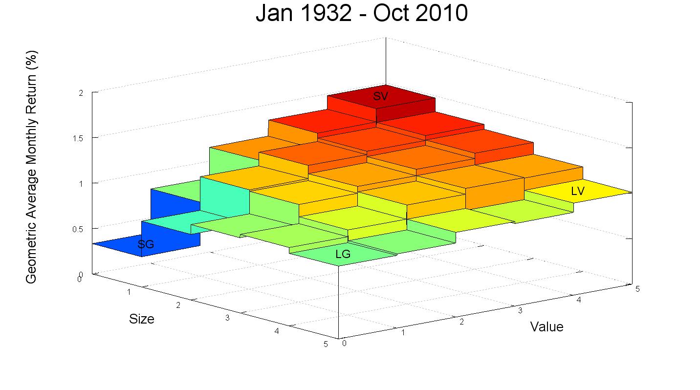
The plot below utilizes data on 25 portfolios formed by sorting stocks on both size (market capitalization) and value (book to market ratio) characteristics to illustrate the magnitude of these effects in the United States. The historical return data used to generate these plots was compiled by Eugene Fama and Kenneth French, and the data is available at Kenneth French’s website. The z-axis of the plot shows the geometric average of the monthly returns for each of these 25 portfolios over the past 78 years.
Clearly, the small-value category has earned significantly higher returns over this period than the large-growth category, and there is a general trend towards higher returns as size decreases and value increases. The exception is the small-growth category, which is the worst performing of all the portfolios. Specifically, the monthly geometric returns are LG = 0.80%, LV = 1.01%, SG =0.33%, and SV = 1.48%.
There has been much debate about whether these higher historical small cap and value returns are due to irrational neglect of small/value stocks (underpricing) by investors or whether the effects are the rational result of a higher risk associated with these asset classes. Which explanation you believe has important consequences for your future investment decisions. If you believe these higher returns are due to irrational investor behavior, then these asset classes represent an excellent opportunity for intelligent investors. However, one must keep in mind that there is a reasonable possibility that an irrational small-value premium will not persist in the future as more investors learn about small cap and value investing and more products are developed to enable investors to invest in these asset classes at a low cost.
Alternatively, if you believe these higher returns are the rational result of the higher risk for these asset classes, then a higher portfolio allocation to small stocks and value stocks will only be attractive to investors who are in a position to tolerate this increase in risk. In the risk scenario, the decision on what degree to tilt your portfolio towards small/value stocks will be similar to your decision on allocating your portfolio between stocks and bonds. Higher risk tolerance will lead to allocating more to the riskier asset with the higher expected return. Persistence of the small and value effects is more likely if the higher returns are genuinely a rational compensation for risk, since investors will be less anxious to bid up the prices on these stocks if they are truly more risky.
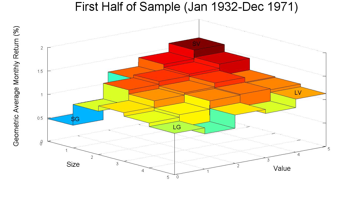
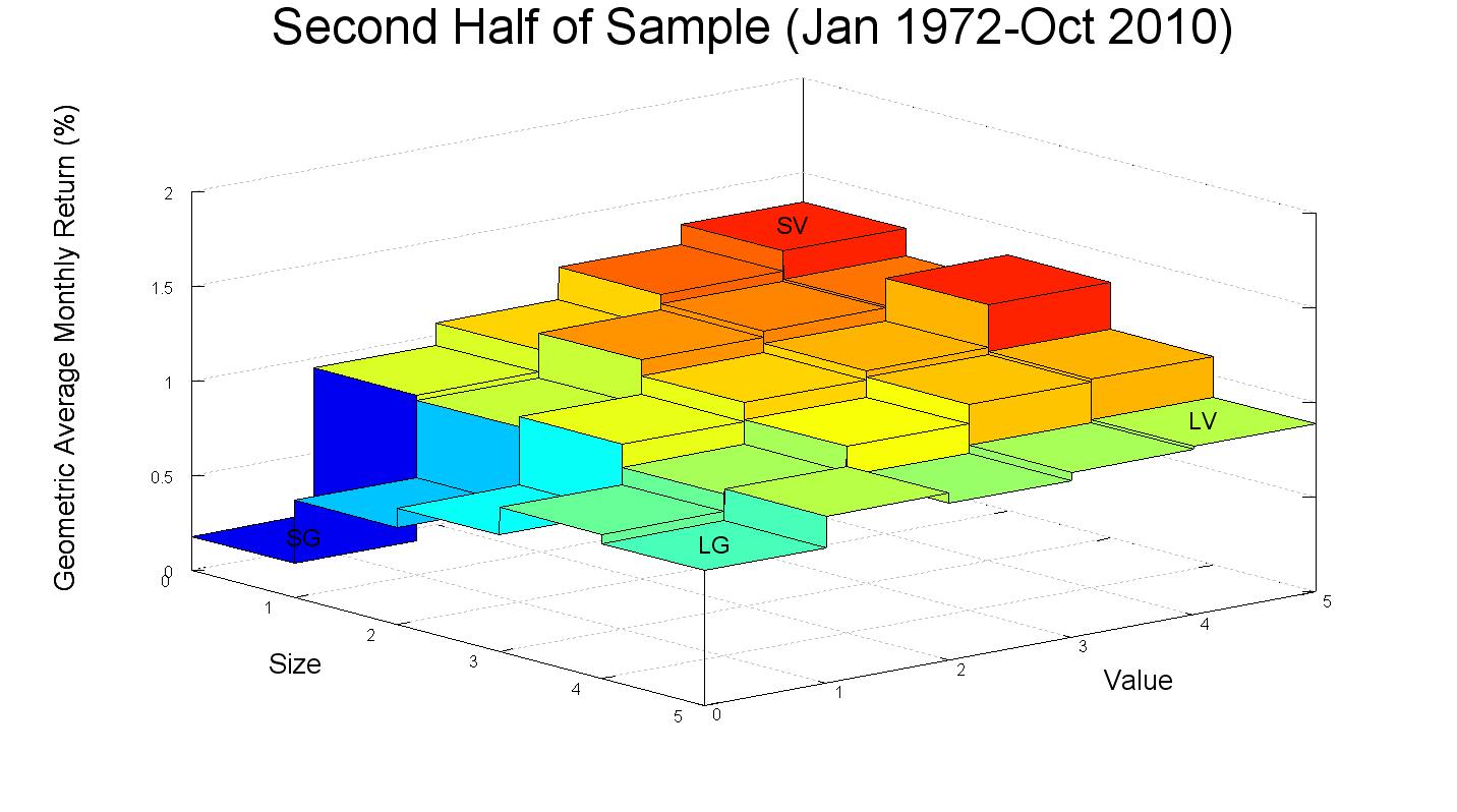
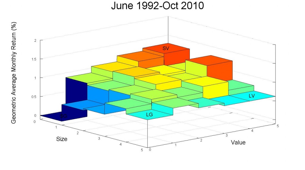
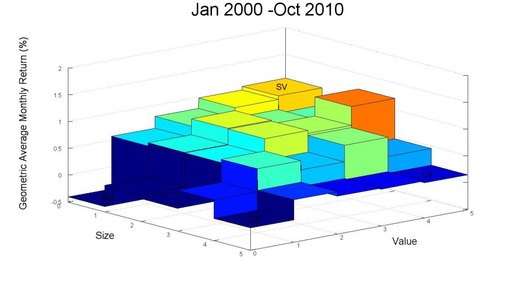
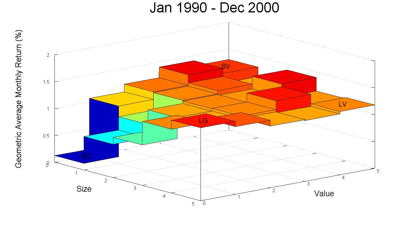
The argument over the small and value premiums is quite complex, and explaining the nuances of the various arguments is beyond the scope of this post. However, it is interesting to look at the relative performance of these 25 portfolios over a variety of date ranges to get some sense of the persistence and robustness of these effects. Some selected ranges are plotted below, and an Octave script is provided to allow the reader to generate additional plots over any desired range of dates. The color vs. return scale is consistent across the various plots so the returns over the different ranges will be easily comparable. The averages are all calculated as geometric averages.
First Half of Data Sample:
Second Half of Data Sample:
Recent Ranges:
Years since original Fama-French study of small-value effects (published June 1992):
Last 10 years:
These past ranges all some indication of a small-value premium. However, it is possible to find relatively long periods where the effects do not hold up well, such as 1990-2000.
Food for Thought:
If you do decide to overweight small-value stocks in your portfolio, keep in mind that there are costs associated with small-value investing that are not captured in the returns I have plotted. The trading costs, index reconstitution costs, and taxes may be higher than they would be for a whole market index. Also, many funds marketed as “small-value” funds may not actually be as “small” and “value” as the SV box in the plots above. In a future post, I plan to look at the actual Fama-French factor loading of some popular small cap and value indexes so they can be compared with the factor loadings of the Fama-French 25 portfolios.

Very accurate description! Thank you!