Warning: "continue" targeting switch is equivalent to "break". Did you mean to use "continue 2"? in /home/calcul9/public_html/wp-content/themes/suffusion/functions/media.php on line 580

Warning: "continue" targeting switch is equivalent to "break". Did you mean to use "continue 2"? in /home/calcul9/public_html/wp-content/themes/suffusion/functions/media.php on line 583

Warning: "continue" targeting switch is equivalent to "break". Did you mean to use "continue 2"? in /home/calcul9/public_html/wp-content/themes/suffusion/functions/media.php on line 586

Warning: "continue" targeting switch is equivalent to "break". Did you mean to use "continue 2"? in /home/calcul9/public_html/wp-content/themes/suffusion/functions/media.php on line 589

Warning: "continue" targeting switch is equivalent to "break". Did you mean to use "continue 2"? in /home/calcul9/public_html/wp-content/themes/suffusion/functions/media.php on line 592
2011 January » The Calculating Investor

So far, so good, but the debate is not over…and may not be for a while

In late 2005, PowerShares launched an ETF (ticker symbol: PRF) based on a controversial new “index” known as the Research Affiliates Fundamental 1000 Index (RAFI 1000).   We now have over 5 years of return data for this fund, and this seems to me to be enough data for us to take a preliminary look at the strategy’s performance. 

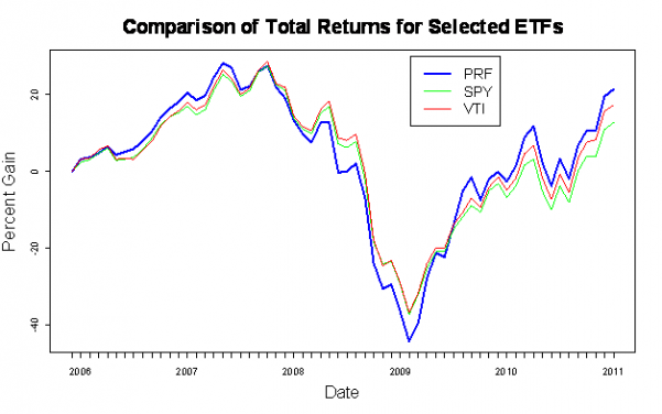
A quick comparison of PRF against popular traditional index funds such as SPY and VTI is shown below.  This plot shows total returns (including dividends).

This graph shows that PRF has outperformed both SPY and VTI over the past 5 years, but it also experienced a larger drop during the crisis of 2008 and 2009.  To properly evaluate the performance of PRF, we need adjust the returns for risk using an asset pricing model such as the Fama-French Three Factor Model (FF3F).  However, before I get to the detailed analysis, I’d like to review what Fundamental Indexing is and why it is controversial.

Continue reading »

Extracting Inflation Expectations from Treasury and TIPS Yield Curves

Update (08/22/2012): I have posted a similar but simplified method for calculating the breakeven rate here.

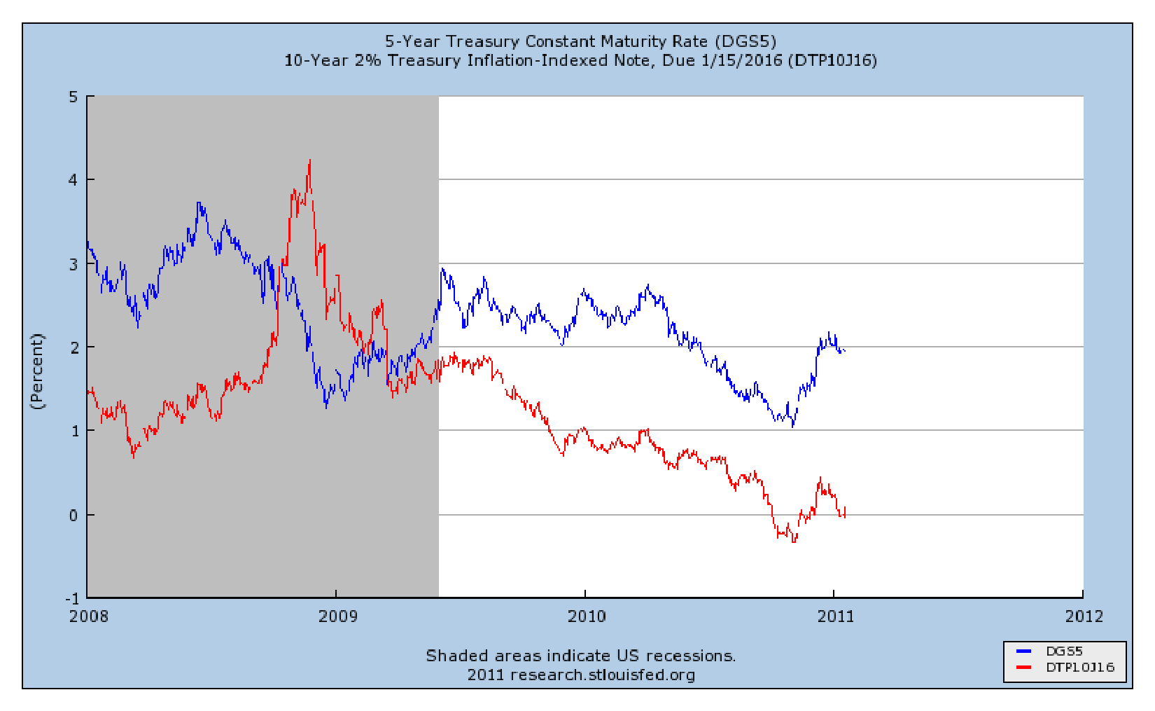
What level of inflation do market participants expect over the next 5, 10, or even 30 years?   There are many methods of varying complexity that investors and policymakers use to estimate the level of expected inflation, but one relatively straightforward method is to examine the “breakeven” inflation rate which is the difference in interest rates between Treasuries and TIPS.  This method has the advantage of being determined by market prices, so it reflects the views of investors who have money on the line.

A simple example illustrating the 5-year breakeven inflation rate is shown here:

Continue reading »

How well can the small-value premium be captured using ETFs?

In a previous post, I plotted the returns of 25 portfolios which were formed by sorting stocks on both size and value characteristics.  The data, from the Kenneth French website, showed a clear pattern of increasing returns as size decreased and value (measured by book-to-market ratio) increased.  In other words, the small-value portfolio had outperformed the broader market over most periods of 20 years or more, and the margin of outperformance was often quite large. 

Fama and French, who built the size and value effects into an asset pricing model, believe that the higher returns of small stocks and value stocks are related to the higher risks associated with holding these stocks.  This may be true, and there is some persuasive evidence supporting the Fama-French viewpoint.  However, another issue with capturing the small-value premium is cost.  The returns of the Fama-French 25 portfolios do not include trading costs, fees, or taxes, and these costs are likely to be higher for investors who are trying to implement a small-value tilt in their personal portfolio.   

In this post, I will evaluate several ETFs which track popular indexes and calculate how well these funds capture the theoretical returns predicted by the Fama-French model.  In addition, I will place the factor loadings of these funds in the context of the Fama-French 25 portfolios.  For example, does a fund which is described as a “small-value” fund really behave similarly to the most extreme small-value portfolio from the Fama-French 25 portfolios?  If not, which of the portfolios does it approximate most closely? 

The Fama-French regression equation is shown here:

 r_{i}-r_{f}=\alpha _{i}+b_{i}\left ( R_{M}-r_{f}^{} \right )+s_{i}SMB+h_{i}HML+\epsilon _{i}

Continue reading »

Displaying Country Weights for International ETFs in Google Earth

Google Earth is a great tool for looking at many different types of data.  A quick Google search will show hundreds of on-line Google Earth projects which use the tool to display data on everything from the health of marine ecosystems to the status of U.S. airline flights. 

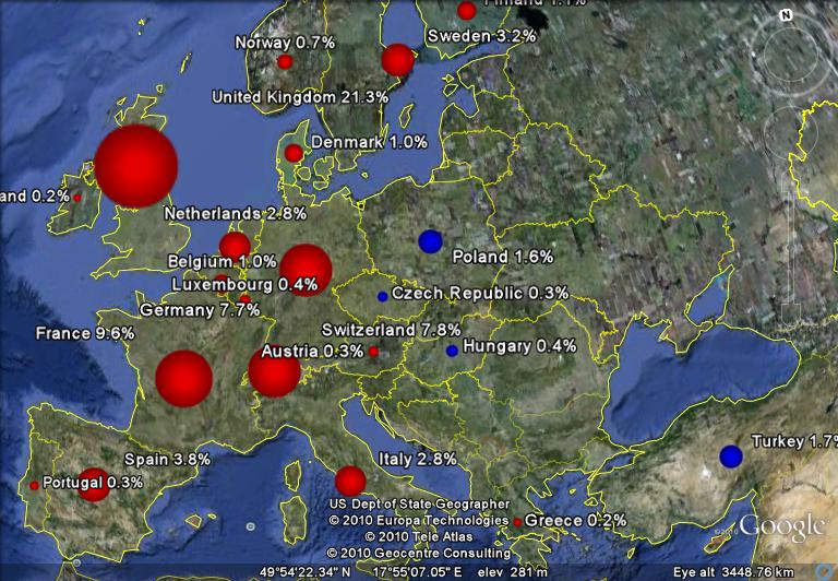
I’ve put together a Python script to display the country weights for two international ETFs;   EFA is an iShares ETF which tracks the MSCI EAFE index, and VWO is a Vanguard ETF which tracks the MSCI Emerging Markets index.  I used red placemarks for EFA and blue for VWO.  In both cases, the area of the placemark is proportional to the country’s weight in the respective fund.  These weights vary over time with a country’s market cap, so each country weight shown is for a particular date (9/30/2010 for EFA and 11/30/2010 for VWO).

A screenshot of the European section of the map is shown here:

Continue reading »

Over the years, investors and academics have noted that small market capitalization stocks and value stocks have tended to outperform the broader market.  This outperformance has been observed over long periods of time in both U.S. and international stock markets.

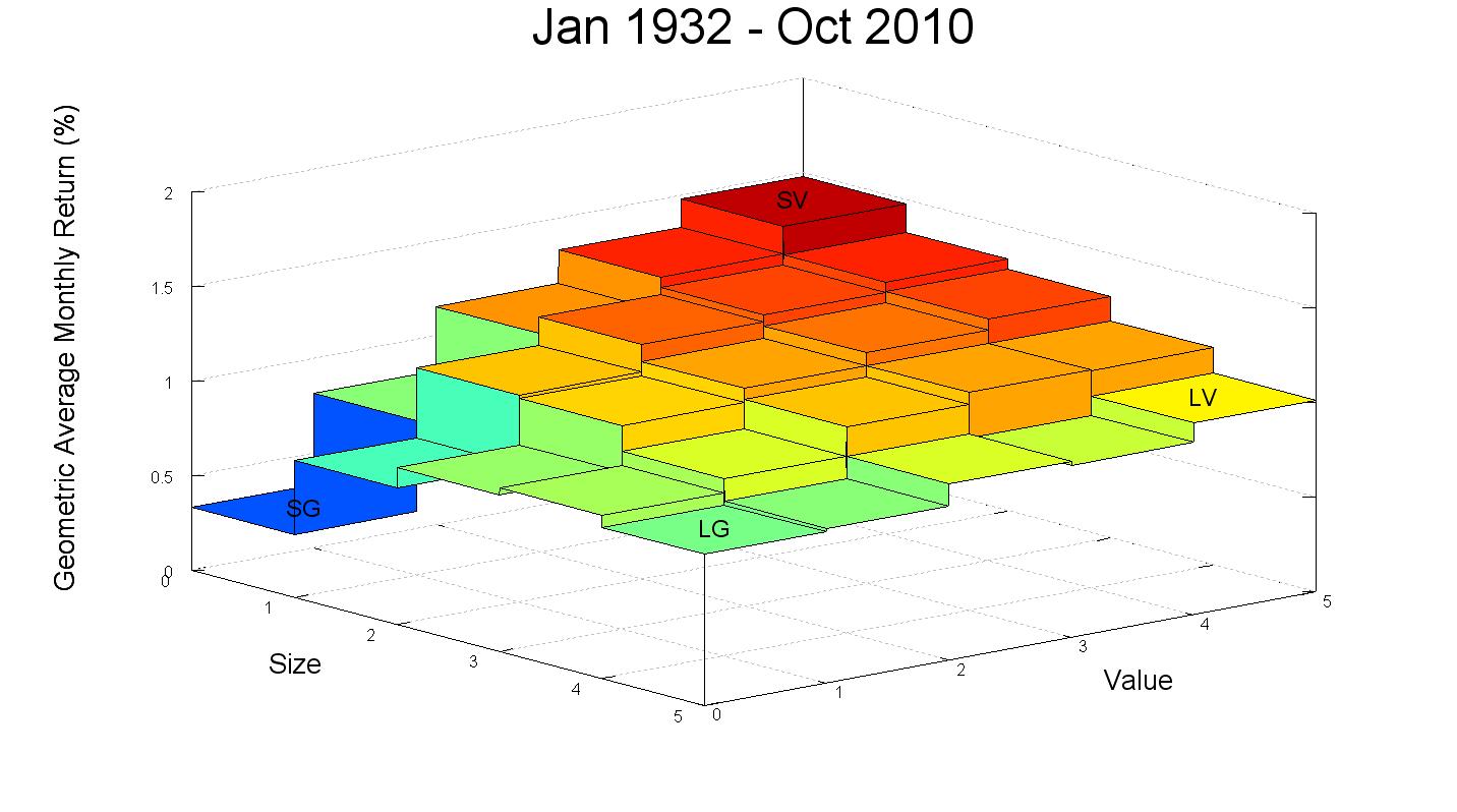
The plot below utilizes data on 25 portfolios formed by sorting stocks on both size (market capitalization) and value (book to market ratio) characteristics to illustrate the magnitude of these effects in the United States.  The historical return data used to generate these plots was compiled by Eugene Fama and Kenneth French, and the data is available at Kenneth French’s website.  The z-axis of the plot shows the geometric average of the monthly returns for each of these 25 portfolios over the past 78 years.


Continue reading »

Money Weighted Returns vs. Time Weighted Returns

What is the proper way to calculate investment returns?  Unfortunately, the answer is somewhat complicated.  The two most frequently used  methodologies are the “money-weighted” and “time-weighted” methods.  In addition, an approximation of the money-weighted method, known as the “Modified-Dietz” method, is also commonly used.  These three methods can sometimes give very different results.  The “correct” calculation method to use will depend on how you plan to use the results. 

My objective in this post is to compare the three common return measures: the money-weighted return, the time-weighted return, and the Modified-Dietz return.  I will provide examples of how these measures can differ and explain when each should be used.

Consider three investors, Larry, Moe, and Curly, who each contributed $1,000 at the end of each month in 2010 to an S&P500 index fund.  Larry’s starting account value at the beginning of 2010 was $1,000, Moe’s was $10,000, and Curly’s was $100,000.  The 2010 return of each investor, as calculated by each of the three methods, is shown here:

2010 ReturnsStarting BalanceMonthly ContributionEnding BalanceMoney Weighted ReturnTime Weighted ReturnModified Dietz Return
Larry$1,000$1,000$14,668.0426.51%15.05%25.56%
Moe$10,000$1,000$25,022.6819.69%15.05%19.47%
Curly$100,000$1,000$128,569.0215.72%15.05%15.70%

Continue reading »