Case-Shiller Background
The Case-Shiller numbers for January 2011 were released today, and the data shows that the nationwide decline in home prices is continuing. Of the 20 metro areas tracked by Case-Shiller, 19 showed a decline in January. I thought it would be interesting to take a closer look at how the Case-Shiller index in each market has performed over time.
Explanation of Plots
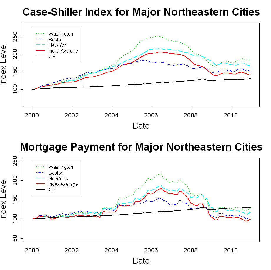
In this post, I have plotted the Case-Shiller metro area data from January 2000 through January 2011. I have assigned each metro area to one of five U.S. regions, and I have created a plot for each region.
The top window of each plot shows how “constant-quality” home prices have varied for each metro area within the region. In addition, the Consumer Price Index (CPI) and the 20-city Case-Shiller composite index are shown in each plot.
In the bottom window, I have adjusted each housing index on each date by the interest rate for a 30-year fixed mortgage on that date using the annuity payment equation.
![]()
In other words, this window shows an index of how mortgage payments have varied over time for a new buyer of a “constant-quality” home. The payment indexes have also been rescaled to a starting value of 100.
The purpose of the mortgage-rate-adjusted plots is to give some idea of how home affordability has varied over time. I am not suggesting that payment level is the only thing that matters to the new home buyer, and I am not suggesting that home valuation should vary directly with mortgage rates. However, mortgage rates do play a role in the home purchase decision, and I think it is interesting to look at this transformation of the Case-Shiller data.
Regional Case-Shiller Plots
The plots below show the Case Shiller data for each U.S. region.

