Warning: "continue" targeting switch is equivalent to "break". Did you mean to use "continue 2"? in /home/calcul9/public_html/wp-content/themes/suffusion/functions/media.php on line 580

Warning: "continue" targeting switch is equivalent to "break". Did you mean to use "continue 2"? in /home/calcul9/public_html/wp-content/themes/suffusion/functions/media.php on line 583

Warning: "continue" targeting switch is equivalent to "break". Did you mean to use "continue 2"? in /home/calcul9/public_html/wp-content/themes/suffusion/functions/media.php on line 586

Warning: "continue" targeting switch is equivalent to "break". Did you mean to use "continue 2"? in /home/calcul9/public_html/wp-content/themes/suffusion/functions/media.php on line 589

Warning: "continue" targeting switch is equivalent to "break". Did you mean to use "continue 2"? in /home/calcul9/public_html/wp-content/themes/suffusion/functions/media.php on line 592
Uncategorized » The Calculating Investor

I use Google Analytics to track traffic on this site, and I’ve found that the two previous posts on downloading return data from Yahoo! Finance are relatively popular.  For this reason, I’m posting some updated R code which can be used to download returns for a batch of stocks or funds.

My first post on this topic included R code for downloading monthly or weekly returns from Yahoo! Finance, and I created a short video tutorial to demonstrate the code. My second post provided a Google Docs spreadsheet which can be used to download monthly returns.

In this post, I’ve updated the original R code to allow monthly returns for multiple stocks or funds to be downloaded into a single CSV file. This is useful if you want to compare factor loadings for multiple funds, or if you simply want to get the monthly returns for all the funds in your portfolio. Continue reading »

About two years ago, I posted some region by region plots of the Case-Shiller home price data. I thought it would be interesting to re-run those plots to see how things have changed since 2011.

The plots below show the housing price history for major cities within each region. Each plot also includes the 20 city average data series.  Each city’s price history is normalized to 100 in January 2000.  Since the Case-Shiller data is not adjusted for inflation, I also added a normalized CPI-U series to each plot.

The “Mortgage Payment” plot shows the price indices adjusted to account for changing mortgage rates.  This plot incorporates both the Case-Shiller data and the mortgage rate to show how the payments for a 30 year fixed rate mortgage have varied for a “constant-quality” home.

northeast_shiller Continue reading »

In my previous post, I showed how to create equity return factors using principal component analysis. In this post, I’m going to compare the three PCA factors I created to the three Fama-French factors.

The goal of this post is to determine whether or not the Fama-French factors are leaving anything significant on the table that the PCA factors, which capture as much covariance in the target portfolios as is possible with three factors, are able to pick up.

In other words, I’ll be comparing the R^2s and alphas for both the Fama-French factors and the PCA factors, and, after some re-arranging, I’ll also compare the factor loadings.

Data

The Fama-French 3 Factor (FF3F) data and the Fama-French 25 size and value sorted portfolio (FF25) data come from the Kenneth French website.  The PCA factors were calculated in the previous post, and I posted the data in a Google Docs Spreadsheet.

R^2 and Alpha using PCA Factors and Fama French Factors

As a first step, the R^2s and alphas for the FF25 portfolios can be calculated using both the Fama-French factors and the PCA factors.

The PCA factors will give us the best fit across the 25 portfolios that is possible with three factors, so we expect the R^2s for the Fama-French factors to be lower on average. The question is: How much lower?

The tables below show the R^2s for the PCA Factors and Fama-French Factors.  For each table, the values highlighted in green have an R^2 which is higher than the alternative model, and the values highlighted in red have an R^2 which is lower than the alternative model.

pcarsquared

ffrsquared Continue reading »

The most popular “factors” for analyzing equity returns are the three Fama-French factors (RMRF, HML and SMB).  The RMRF factor is the market return minus the risk free rate, and the HML and SMB factors are created by sorting portfolios into several “value” and “size” buckets and forming long-short portfolios.

The three factors can be used to explain, though not predict, the returns for a variety of diversified portfolios. Many posts on this blog use the Fama-French 3 Factor (FF3F) model, including a tutorial on running the 3-factor regression using R.

An alternative way to construct factors is to use linear algebra to create “optimal” factors using a technique such as principal component analysis (PCA). This post will show how to construct the statistically optimal factors for the Fama-French 25 portfolios (sorted by size and value).

In my next post, I will compare these PCA factors to the Fama-French factors.

Description of Data

The data used for this analysis comes from the Kenneth French website.  I’m using the Fama-French 25 (FF25) portfolio returns which are available in the file titled “25 Portfolios Formed on Size and Book-to-Market”.  I’m using the returns from 1962 through 2012 since the pre-Compustat era portfolios have relatively few stocks.

The Fama-French factors are also available on the Kenneth French website in the file titled “Fama/French Factors”.  In this post, I will use not use the Fama-French factors themselves, but I do use the factor data file to get the monthly risk-free rate.

For reference, the arithmetic average monthly returns of the FF25 portfolios are plotted for the date range used in this analysis.  The Octave script to create this plot was provided in an earlier post.

port24avgs

Continue reading »
Thinking about Risk in Retirement Account Roll-overs

Have you ever wondered how much the level of the stock market can vary over one week?  What about two weeks or a month?

Until recently, I had not thought much about the range of short term market fluctuations. After all, I consider myself a long-term investor! However, a recent experience piqued my curiosity, and I decided to do a little research.

About a month ago, I transferred a small retirement account from a former employer into another existing retirement account.  I wasn’t able to do an electronic transaction or a “transfer in-kind“, so  I had to liquidate the old account before sending the funds to the new account provider.  The provider of the old account issued a paper check, and there was a surprisingly long delay for mailing and processing before the funds showed up in the new account.

The experience got me thinking about the risk of being out of the market (in cash) for short periods of time while transferring funds between accounts. The market may fall (good!) or rise (bad!) by a meaningful amount in a fairly short time.  If the amount being transferred is large, the risk can be significant.

In this post, I’ll look at some historical statistics on short term market returns.

Data Source and Methodology

I downloaded daily return data from July 1963 – August 2012 from the Ken French website.  The returns are available in the Fama/French Factors [Daily] file.  The daily risk-free rate needs to be added back into the RMRF column to get the total returns.  Note that these are “total stock market” returns, so the results may differ slightly from a similar analysis using S&P500 returns.

I calculated compound returns over rolling periods of 5, 10, 15, and 20 trading days.  I did not restrict the analysis to calendar week boundaries.  I then calculated a number of statistics on the 1, 5, 10, 15, and 20 day returns.

Note that the short-term return distributions are very “fat-tailed”, so I didn’t do any statistics which assume normal distribution.  Instead, I calculated the historical frequency of returns which exceed the various cutoffs.

Summary Statistics

Continue reading »

A Long Term Comparison of Tilting Strategies

A frequent debate among index fund investors involves “tilting” or over-weighting particular asset classes.  Usually, the asset classes to be over-weighted are small cap and value stocks.

Some investors believe that a portfolio tilted towards small cap and value is superior to a market-weight portfolio.  These investors believe that over-weighting these asset classes (relative to market-weight) and under-weighting other asset classes increases the likelihood of a superior outcome ( i.e. higher returns, lower risk, or both).

Other investors believe that a market-weight or TSM (Total Stock Market) portfolio is the best choice.  These investors believe we don’t know which asset classes are most likely to outperform in the future, and that the market weights reflect the best balance of risk and reward given the information available to investors at any particular time.

Debates often involve detailed analysis of past performance which, of course, has only limited value for forecasting the future!

Nevertheless, even making apples-to-apples comparisons of past performance is complicated because “live” index funds which track the various asset classes have been available for a relatively short time.

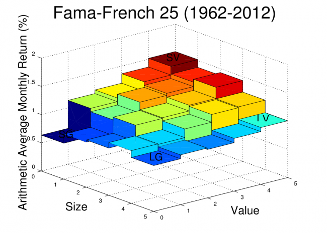
Academic datasets for TSM, small cap, and value indexes exist for longer periods of time (back to 1926 for U.S. stocks), but these indexes do not account for fund expenses and trading costs. Also, they sometimes involve extreme tilts toward illiquid stocks which are difficult for index providers to implement in practice.

In this post, I will evaluate the Fama-French factor loading for several “live” index funds, and I will then use the regression coefficients and alpha (which should capture expenses and other costs) to construct “pseudo-funds” which cover the full range of the academic data from to 1926 to present.

These pseudo-funds are an attempt to adjust the historical data for the expenses, trading costs, and modest factor loadings that we typically see with today’s live funds. The pseudo-funds can be used to compare realistic TSM and tilting strategies over an extended historical range.

Since we can’t know the future, I don’t think this post will settle the debate on tilting (No chance!), but this is my best attempt to look at the historical data through a fair lens.

Continue reading »
Downloading Historical Prices and Converting to Returns

Many types of investment analysis require historical returns.  For example, if we want to calculate the ex-post Sharpe ratio, CAPM beta, or Fama-French factor loadings of a fund, we need the fund’s historical returns (including dividends!).

One source of data which includes dividend adjustments is Yahoo! Finance.  You can click on the “Historical Prices” option after looking up the quote for a particular ticker to see a table of past prices.

For example, Yahoo! Finance provides daily, weekly, or monthly prices for SPY, an S&P500 ETF, going back to 1993.  These quoted prices include the “Adj* Close” column which gives the historical closing prices adjusted for past splits and dividends.

The Yahoo! Finance adjusted closing prices can be downloaded to a spreadsheet and the daily, weekly, or monthly total returns can be calculated from these prices. However, this can be a tedious process if it needs to be repeated for multiple stocks/funds, so I have created a Google Docs spreadsheet which can automatically import the prices for a specified stock or fund and convert the price data into monthly returns.

Example Return Download

My Google Docs return download spreadsheet is read only, so it isn’t possible to directly edit after opening.  However, if you are logged into Google Docs, you can create a copy (under the “File” pulldown) to your personal account and the copy will have full edit privileges.

Here is an embedded capture of the “Total Returns” sheet.

The values in blue are the values which should be edited by the user.  In this example, I download the monthly returns for SPY starting in January of 2000.  Updating the blue values (and waiting for the updates to propagate through the rest of the sheet) will give you the historical returns for the fund or stock of your choice. Continue reading »

Yield Curves and Break-even Inflation

In a previous post, I showed how to calculate the break-even rate of inflation using the real and nominal yield curve data available from the U.S. Treasury website.

In this post, I will show how to automatically import the most up-to-date yield curve data into a Google Docs Spreadsheet using the “ImportXML” function. This yield curve data is useful for many financial calculations, but in this post I will again use the yield curve data to do a rough estimate of the break-even inflation rate.

Read the “Notes on the Break-even Inflation Calculation” section for an explanation of the break-even rate and a clarification on why the method shown only gives an approximation of the break-even rate.

ImportXML Function in Google Docs

The ImportXML function can be used to import data from XML files. The syntax of the command is:

=importXml(<url>,<xpath expression>)

The Treasury website has XML format files showing real yields for the current month and nominal yields for the current month.

The ImportXML example shown here will import the real 5-year yields into the spreadsheet.

=importXml(“http://www.treasury.gov/resource-center/data-chart-center/interest-rates/Datasets/real_yield.xml”, “//TC_5YEAR”)

The “//TC5_YEAR” is an xpath expression which selects all the nodes named “TC_5YEAR” in the target document.   Other maturities in the document can be selected by changing the node name.  For example, the 30-year real yields are selected by changing the xpath expression to “//TC_30YEAR”.

Example Google Docs Spreadsheet

I have created an example Google Docs spreadsheet which uses the ImportXML data to download the real and nominal yields at several maturities.  The example sheet is read-only, but if you would like to customize you can select “make a copy” from the “File” pull-down and edit the copy of the spreadsheet.  You must be logged into your Google Docs account to make a copy.

The spreadsheet automatically imports the yield information for the current month to the sheet labeled “Yields”.   The “Summary” sheet extracts the most recent set of daily yield curve data from the “Yields” sheet and uses it to estimate the break-even inflation rate.  The yield curves and the breakeven inflation curves are plotted in the “Summary” sheet as shown here:

Continue reading »

International Fama-French Portfolio and Factor Data

Regular readers know that my posts frequently utilize data from the Kenneth French data library. The data library is an excellent resource for anyone interested in the small cap and value effects and the Fama-French 3 Factor model.

Recently, I learned that the data library has been expanded to include data from developed equity markets other than the U.S. This opens up a variety of interesting possibilities for further analysis!

For a start, I created some plots of the small cap and value effects for each region in the new data set. The plots use the return data for the 25 portfolios sorted by size (market cap) and value (book/market).  The z-axis on each plot shows the average monthly return (geometric) for each portfolio.  The returns are U.S. dollar returns.

In a previous post, I created some similar plots for the U.S. market and provided some sample Octave code for producing these plots.

The color scale for each of the plots is tied to the magnitude of the monthly return, and the mapping between color and average return is consistent across plots. This makes it easy to compare returns between the different regions.  However, this color scaling does make the Japan plot a bit difficult to read since the average returns for Japan were much lower than the average returns for the other regions over the sample period.

The new data set also includes the Fama-French 3 Factor model factors (RMRF, HML, and SMB) for each region.  I calculated the mean, standard deviation, Sharpe ratio, standard error, and t-stat for the factors for each region and included these results in a table below each plot.

GLOBALRMRFSMBHML
Mean5.51%1.71%4.33%
Std18.91%9.33%13.65%
Sharpe0.2910.1830.317
StdE4.13%2.04%2.98%
t-stat1.330.8411.45
Continue reading »

Recommended Reading

I never completed my previously promised series on the equity risk premium, but for readers who are interested in the topic I would highly recommend the recently released “Rethinking the Equity Risk Premium” from the CFA Institute.

This free PDF contains a variety of interesting perspectives on the future of the equity risk premium. Note that a print version of the book is available on Amazon, and Kindle users can download a version formatted for Kindle for just $1.

Key Takeaway

The book has analyses from both academics and practitioners, and a variety of estimation methods are used. In my opinion, the key takeaway is that nearly all of the experts forecast future equity returns which are lower than the historical averages. Several well-argued forecasts put expected nominal equity returns in the 6%-7% per year range.

The key reason for the lower forecasts is simple. Equity valuations are higher than their average historical level. This leads to lower yields, and less potential for capital gains from further expansion of P/E ratios. Lower yields and less potential for growing valuation multiples mean that higher earnings growth must pick up the slack. Several authors provide reasons why higher-than-historical earnings growth is unlikely.  Many measurable factors actually suggest lower future economic growth (demographics, debt levels, scarce resources), and economic growth is closely linked to earnings growth. I found much of the analysis to be very convincing, though not especially uplifting!

Implications for Investors

My thoughts after reading this document are that few investors saving for retirement are prepared for equity risk premiums and real returns as low as those suggested by many of these experts. The experience of the 80s and 90s led many investors to believe that setting aside a relatively modest sum each year would lead to a comfortable nest egg by the time retirement came around. The last decade has certainly made individual investors more pessimistic about investing returns, but I’m not sure how many fully understand the impact of lower returns on their investing goals.

The table below illustrates the amount of annual savings needed to reach a one million dollar retirement goal at several different levels of nominal annual return. This simple example assumes that an investor starts saving at age 25 and continues making annual contributions through age 65 (41 contributions).  I assume that payments are made at the beginning of each year.

 
Expected ReturnTarget FV AmountRequired Annual Contribution
10%$1,000,000.00$1,863.36
8%$1,000,000.00$3,297.68
6%$1,000,000.00$5,715.90
4%$1,000,000.00$9,632.09
2%$1,000,000.00$15,658.71
Continue reading »