Warning: "continue" targeting switch is equivalent to "break". Did you mean to use "continue 2"? in /home/calcul9/public_html/wp-content/themes/suffusion/functions/media.php on line 580

Warning: "continue" targeting switch is equivalent to "break". Did you mean to use "continue 2"? in /home/calcul9/public_html/wp-content/themes/suffusion/functions/media.php on line 583

Warning: "continue" targeting switch is equivalent to "break". Did you mean to use "continue 2"? in /home/calcul9/public_html/wp-content/themes/suffusion/functions/media.php on line 586

Warning: "continue" targeting switch is equivalent to "break". Did you mean to use "continue 2"? in /home/calcul9/public_html/wp-content/themes/suffusion/functions/media.php on line 589

Warning: "continue" targeting switch is equivalent to "break". Did you mean to use "continue 2"? in /home/calcul9/public_html/wp-content/themes/suffusion/functions/media.php on line 592
Uncategorized » The Calculating Investor » Page 3
How Much is that Increase in MPG Really Worth?

With fuel prices near the $4 per gallon level, there has been a lot of discussion in the media about fuel economy.  Last week, on the National Public Radio program, Marketplace, I was listening to a story about the rising demand for fuel efficient cars, and I was struck by this quote:

Jonathan Banks follows the used car market at the National Automobile Dealers Association. He says prices on used Prius models are up 30 percent since the beginning of the year. That’s more than for other used cars, though those are also in high demand.

Thirty percent seemed to me to be a quite a large price increase, and I decided to take a closer look at how fuel costs and fuel economy are related.

MPG vs. GPM

Most of us are familar with MPG as a measure of fuel economy, but it actually not the most intuitive measure to use.  The problem with MPG is that it is inversely related to fuel consumption, and this can lead to misperceptions about the cost savings from an increase in MPG.

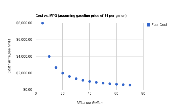
This effect is best illustrated with a graph.  The graph below shows the cost of driving 10,000 miles for various measures of MPG.  I assume a gasoline price of $4 per gallon.

Continue reading »

An Application of the Geometric and Arithmetic Means

Over the past several years there has been a proliferation of ETFs for every imaginable purpose.

One particularly interesting type of ETF is the leveraged ETF. These ETFs are designed to provide 2X or 3X the daily return of a target index such as the S&P500, and they do a reasonable job of achieving this goal.

For example, if the S&P500 is up 1% for the day, the 2X S&P500 fund will be up 2% and the 3X fund will be up 3%. If the S&P500 is down 0.5% for the day, then the 2X fund will be down 1% and the 3X fund will be down 1.5%. (Note that for simplicity I’m not considering the fees and implicit borrowing costs associated with leveraged funds in this post).

Based on this description, you might think that if the S&P500 is up 10% for the year, then the 2X S&P500 fund would be up 20% and the 3X S&P500 fund will be up 30%. However, this is not the case. In fact, under some conditions, the 2X and 3X leveraged funds may be up even less than the S&P500 index. How can this be? If the daily leveraged returns are 2X or 3X the returns of the target fund, then why won’t the annual returns be 2X or 3X the annual returns?

To understand why there is discrepancy between daily returns and long-term returns, we need to review the difference between the arithmetic and geometric means.

Arithmetic Mean

The arithmetic mean is what most of us think of when we hear the term “average”, and it is defined by this equation.

 Arithmetic\:Mean = \frac{1}{n}\sum_{i=1}^{n}a_{i}

Geometric Mean

The geometric mean is the nth root of the product of n numbers, and it is defined by this equation:

 Geometric\:Mean=\left ( \prod_{i=1}^{n} a_{i}\right )^{1/n}=\sqrt[n]{a_1a_2...a_n}

The geometric mean can also be calculated using logarithms:

 Geometric\:Mean=exp\left [ \frac{1}{n} \sum_{i=1}^{n}ln\:a_{i}\right ]

The geometric mean only applies for positive numbers. So, when using investment returns, the geometric mean is calculated using the decimal multiplier equivalent values. For example, a 6% return is 1.06, and a -4% return is 0.96. Continue reading »

Robert Shiller and Jeremy Siegel were on CNBC this past week debating stock market valuation. Shiller makes the case that the market is overvalued based on the historically high PE10 ratio which I wrote about several months ago.

Siegel is more bullish. He argues that valuations are attractive based on the current PE ratio, and he believes the current equity risk premium is quite high. In other words, he believes the expected return on stocks is high relative to the expected return on bonds.

What do you think? Do you agree with Siegel or Shiller?

Earlier this month, Yale University announced announced that an additional ten courses would be available through the “Open Yale Courses” website.

Readers of this site may find the “Financial Theory” course taught by hedge fund manager John Geanakoplos to be especially interesting.  So far, I have only watched the first two lectures, but I’m planning to work through the rest of the course over the next several weeks.

Here is the first lecture:

In this video post, I walk  through a basic demo showing how to run the Fama-French regression using R.

This is my first attempt at doing a screencast, so please let me know if you have any comments or suggestions.  

The demo is easiest to follow when viewed in full screen HD.  In lower resolutions, the on-screen commands may be difficult to read.

Additional Info:

The slides used in this screencast can be accessed here, and the CSV data file is available here.

The R code used in the demo is shown below:

# Fama-French Regression example in R

# Load CSV file into R
ff_data <- read.table("ffdata.csv",header=TRUE,sep=",")

# Extract Fama-French Factors and Fund Returns
rmrf <- ff_data[,2]/100
smb <- ff_data[,3]/100
hml <- ff_data[,4]/100
rf <- ff_data[,5]/100
fund <- ff_data[,6]/100

# Calculate Excess Returns for Target fund
fund.xcess <- fund - rf

# Run Fama-French Regression
ffregression <- lm(fund.xcess ~ rmrf + smb + hml)

# Print summary of regression results
print(summary(ffregression))

Evaluating Investment Alternatives Using Performance Ratios

In this post, I look at several ratios which are used to evaluate investment performance.

The Sharpe ratio, Treynor ratio, and information ratio are all common ratios for evaluating investment managers and investment portfolios.  Each of these measures can be used ex post to evaluate past performance, or they can be used ex ante to help investors make portfolio decisions based on forecasts for various investment alternatives.

The Sharpe Ratio

The Sharpe ratio is one of the most common metrics for evaluating portfolios.

The Sharpe ratio is calculated by dividing the mean excess return of the portfolio by the standard deviation of the excess return.  In other words, this ratio measures the “reward” we can get for a particular level of variability or  “risk”.

The equation for calculating the Sharpe ratio is:

 SR=\frac{R-R_{f}}{\sigma }=\frac{E\left [ R-R_{f} \right ]}{\sqrt{var\left [ R-R_{f} \right ]}}

Continue reading »

Jack Bogle was on CNBC earlier this week, and I always enjoy hearing what he has to say.

I agree with Mr. Bogle’s views on market valuation and the outlook for stock returns, but I disagree with him on international diversification.  However, I always remind myself of Bill Bernstein’s well known quote: “When I disagree with Jack Bogle – I am usually wrong.”

Here are a few links to some other interesting Jack Bogle videos  (more interviews with Jack Bogle are available at morningstar.com):

Bogle on Commodity Investing

Bogle: Past is Not Prologue

Bogle on Financial Reform


Let’s begin with some Q&A:

Question: Why do some financial assets tend to earn higher returns than others?

Answer: Financial theory tells us that, on average, higher returns are earned by financial assets that have higher risk.

Question: Ok, so how do we measure risk?

Answer: One model used for measuring risk is the Capital Asset Pricing Model or CAPM.   In the CAPM, the risk that a security contributes to a diversified portfolio is measured by its beta (or \beta), and the expected excess return of the security is proportional to beta.

The term “excess return” refers to the additional return that the security earns above the risk-free rate.  For U.S. investors, the t-bill rate is typically used as the risk-free rate.

The excess return earned by the market portfolio is also known as the “market risk premium”.  The risk premium for an individual security may be higher or lower than the market risk premium depending on the security’s beta.

If the beta is greater than one (the beta of the market portfolio is one by definition), then the expected return for the security is higher than the market average, and, if the beta is less than one, the expected return is lower.

In the CAPM, the total expected return of a security is given by this equation:

 E\left ( R_{i} \right )=R_{f}+\beta_{i} \left ( E\left ( R_{m} \right )-R_{f} \right )

Notice that only the excess return varies with beta, and the risk free rate is added to the security’s risk premium to get the total expected return.

The variables in this equation are:

 E\left ( R_{i} \right )=expected\:return\:of\:asset
 R_{f} = the\:risk\:free\:rate\:of\:return\:(typically\:a\:tbill\:rate)
 \beta_{i}= asset's\:beta
 E\left ( R_{m} \right)=expected\:return\:of\:the\:market\:portfolio

The “expected return” is the return that the investors expect to earn on average given the current price of the security.  Of course, the expected return is what should happen on average over the very long term, but in any given period the realized return may be very different than the expected return.

All else equal, the expected return is related to price.  If the price rises, and our expectations of the future cash flows from the security are unchanged, then our expected return falls since we are paying more for the same future future cash flows.  Similarly, if the price falls, and our expectations for future cash flows are unchanged, then the expected return will rise.

Continue reading »

Case-Shiller Background

The Case-Shiller numbers for January 2011 were released today, and the data shows that the nationwide decline in home prices is continuing.  Of the 20 metro areas tracked by Case-Shiller, 19 showed a decline in January.  I thought it would be interesting to take a closer look at how the Case-Shiller index in each market has performed over time.

Explanation of Plots

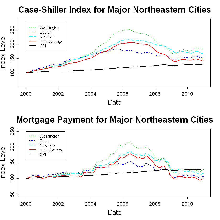
In this post, I have plotted the Case-Shiller metro area data from January 2000 through January 2011.  I have assigned each metro area to one of five U.S. regions, and I have created a plot for each region.

The top window of each plot shows how “constant-quality” home prices have varied for each metro area within the region.  In addition, the Consumer Price Index (CPI) and the 20-city Case-Shiller composite index are shown in each plot.

In the bottom window, I have adjusted each housing index on each date by the interest rate for a 30-year fixed mortgage on that date using the annuity payment equation.

  Annuity Payment = P\left ( i+\frac{i}{\left ( 1+i \right )^{n}-1} \right )

In other words, this window shows an index of how mortgage payments have varied over time for a new buyer of a “constant-quality” home.   The payment indexes have also been rescaled to a starting value of 100.

The purpose of the mortgage-rate-adjusted plots is to give some idea of how home affordability has varied over time.  I am not suggesting that payment level is the only thing that matters to the new home buyer, and I am not suggesting that home valuation should vary directly with mortgage rates.  However, mortgage rates do play a role in the home purchase decision, and I think it is interesting to look at this transformation of the Case-Shiller data.

Regional Case-Shiller Plots

The plots below show the Case Shiller data for each U.S. region.

Continue reading »

I enjoyed this program on behavioral finance from Nova.  However, I think the program is a bit biased against the EMH professors (Fama, Cochrane, and Becker).

I believe that market prices may sometimes be irrational, but I also believe that there is a big difference between showing that individual investors are prone to irrational behavior and showing that markets as a whole behave irrationally.  I think the program does a poor job of distinguishing between the two.

What do you think?

Via The Finance Professor