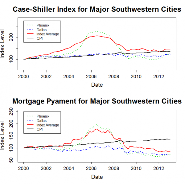
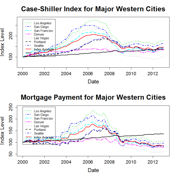
About two years ago, I posted some region by region plots of the Case-Shiller home price data. I thought it would be interesting to re-run those plots to see how things have changed since 2011.
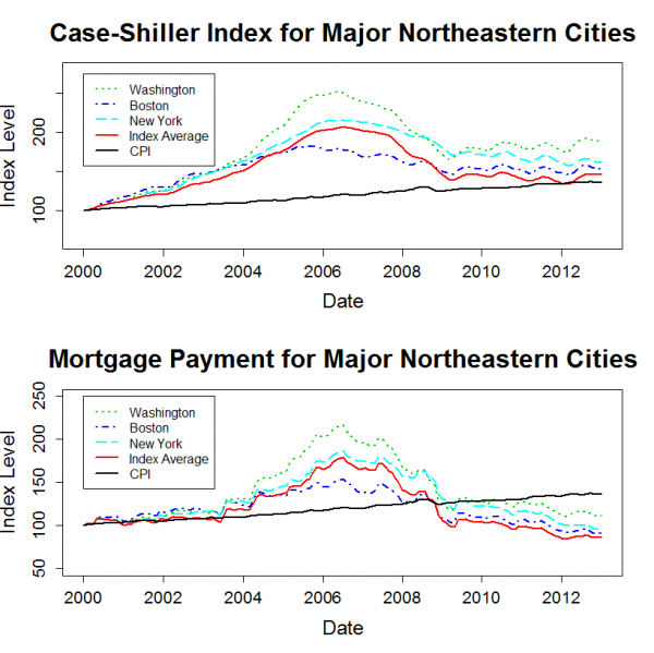
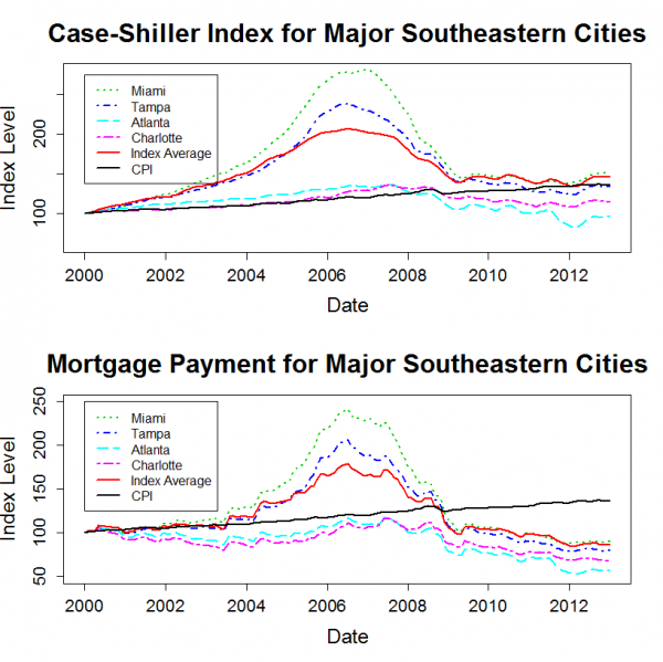
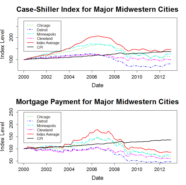
The plots below show the housing price history for major cities within each region. Each plot also includes the 20 city average data series. Each city’s price history is normalized to 100 in January 2000. Since the Case-Shiller data is not adjusted for inflation, I also added a normalized CPI-U series to each plot.
The “Mortgage Payment” plot shows the price indices adjusted to account for changing mortgage rates. This plot incorporates both the Case-Shiller data and the mortgage rate to show how the payments for a 30 year fixed rate mortgage have varied for a “constant-quality” home.
Takeaways
The plots show that, for most markets, nominal home prices have leveled out over the past two years. However, mortgage rates have continued to decline a bit, so the total cost for new home buyers with a 30-year mortgage has continued to trend downwards.
Home prices in many markets are lower in real terms than they were in 2000. The west and the northeast are the exceptions. Despite severe declines from bubble highs, prices in these regions have generally risen by more than inflation since 2000.
R Code:
The R code for generating these plots and specifics of the mortgage payment calculation are given in the original post.